Fleetwood Mac’s Weird, Wacky, Bold and Beautiful Album Covers: Exclusive Book Excerpt
A new book charts the 50-year history of Fleetwood Mac in a distinct and refreshing way.
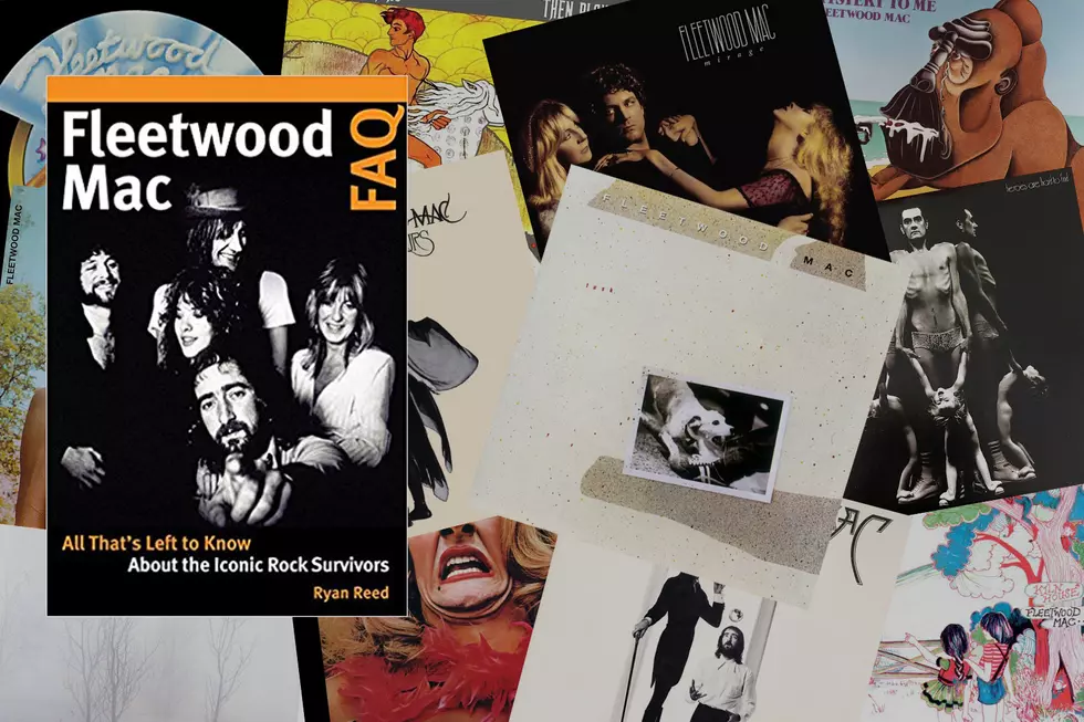
'Fleetwood Mac FAQ: All That's Left to Know About the Iconic Rock Survivors' by UCR contributor Ryan Reed will be available on Oct. 9, but we have an exclusive excerpt below.
Reed took a different path, rather than focusing on the umpteenth retelling of the 'Rumours' soap opera, Peter Green's religious conversion or the many other oft-told stories (though several of them are covered). According to the book's listing at Amazon, where the book can be pre-ordered, 'Fleetwood Mac FAQ' is "a hybrid of historical breakdowns, Q&As, music criticism and 'best of' lists chronicling the band's influence and legacy."
Reed interviewed former band members, producers and journalists – including Rick Vito, Billy Burnette, Ken Callat, Richard Dashut and Anthony DeCurtis – to present the band in a new light.
The below excerpt is a perfect example. Fleetwood Mac's most memorable album artwork is broken down into four categories: The Weird, The Wacky, and The Bold and The Beautiful. Reed gets inside the creation of the photographs used on the LPs' covers, but he also notices a pattern, regardless of the category: Fleetwood Mac's covers frequently involve crotch-based jokes, especially when Mick Fleetwood is involved.
Read the excerpt below.
Let’s survey some of Fleetwood Mac’s most ridiculous and awe-inspiring album art. (Spoiler alert: The drummer is involved in a lot of it.)
The Weird: Heroes Are Hard to Find (1974)
Imagine being sixteen years old in 1974, browsing through the new releases at your local record store, and accidentally stumbling upon the oddity that is Heroes Are Hard to Find. Shot by Herbert Worthington (better known for his work on the White Album and Rumours) with art design by Desmond Strobel, the cover photo is one of the creepiest (and most deceptive) in rock history. Based on a quick glance, you’d probably expect an album of avant-garde noise instead of the commercial pop-rock awaiting inside.
Let’s look at the shot itself: an anorexic-looking Fleetwood, nude except for a pair of lace panties, chest puffed out, ribs protruding, clinging to the outstretched hands of his three-year-old daughter, Amelia, who stands on his shoes. “[Worthington] took that photo of us in a three-way mirror, so the final image is three sides, back-to-back,” Fleetwood recalled in Play On. Sandra Vigon (again, remember her?) confirms one crucial piece of the puzzle: the underwear was hers.
“Those were indeed my undies,” she says. “At that time, I was staying at Herbie Worthington’s house on Hollywood Boulevard, where he also had his studio. I do remember being there for the shoot and donating my lacy shorts. I hasten to add that I wasn’t wearing them at the time, and it was all very innocent. It was a lot of fun as you can imagine with Mick being Mick and Amy being there too.”
Love it or hate it (or just think it’s OK), you can’t deny the staying power: we’re still staring, jaws dropped, decades after Fleetwood first gave us the heebie-jeebies.
The Wacky: 1968’s Mr. Wonderful, 1969’s English Rose
Terence Ibbott worked with the original Fleetwood Mac as both a photographer and an art designer, conceptualizing two of the most bizarre images in rock history. The first, for Mr. Wonderful, is a classic fake-out, cleverly utilizing the physical construction of a gatefold sleeve. The front cover is quirky enough, with a dazed, shirtless Fleetwood staring off into the distance, a doll’s head on his side. But flipping out the jacket reveals a more disturbing, arguably funnier, scene: the drummer’s genitals obscured by shrubbery attached to his pelvis.
“One could almost say Terence had a sick mind in some ways,” says the album’s producer, Mike Vernon, whose name graced numerous liner notes with Ibbott over the years, including the first four Chicken Shack LPs. “Terence had the most imaginative mind, beyond belief. He was just weird. The guy was just . . . weird. He was an extremely clever photographer and a great artist. Whatever artwork that is available is quite highly sought after. Terence would come up with the most daft ideas, some of which were just vulgar to the point of being irresponsible and unusable. But sometimes he came up with extraordinary pictures. The picture of Mick on the double-fold of Mr. Wonderful was extraordinary.”
His work on English Rose could be Ibbott’s best-remembered work, for better or worse. It’s only a U.S. compilation, though easily their best collection of songs from their early days, given the inclusion of non-album singles “Albatross” and “Black Magic Woman” — and it’s topped off by a hilarious and frightening photo of Fleetwood in drag. No one, possibly not even Ibbott himself, knows the exact thinking behind the shot. But Vernon, as good a source for this kind of hypothesizing as anyone, has a strong theory.
“You have to remember that Mick Fleetwood and Terence Ibbott were friends through an association with Mick’s sister,” he says. “And an ‘English Rose’ is a [British] expression: someone who is most likely virginal, in their middle to late teens, pale skin, almost translucent. In the Elizabethan period, they would have their cheeks blushed slightly. They would wear very silky, fancy gowns and dresses and would carry flowers, probably roses, and be bouncing around in the fields among daffodils and spring flowers. Everything is in slow motion, and there’s this gorgeous girl who’s never been touched. And what you end up getting is Mick Fleetwood. This was a play, in Terence’s twisted mind, of what Mick would look like as an English Rose. And it’s absolutely horrific, like some dreadful witch from your worst nightmares.”
The Bold: 1979’s Tusk
(The Ballad of Photographer Jayme Odgers, or How I Learned to Stop Worrying and Love the Photobomb)
Jayme Odgers met Larry Vigon around 1967 while teaching a graphic design class at LA’s Art Center College of Design, which Vigon attended. Around nine years later, Odgers started to merge his graphic design work with photography in the pursuit of hybrid “photo-graphic images,” which he assembled using an “early, Luddite version of Photoshop.” He also started working on album covers, and in 1978, his former pupil came calling and hired him for an exciting new project.
“On the Tusk album, for whatever reason (probably a lavish budget coming off the immense success of [Rumours]), Larry decided on hiring three different types of photographers: a rock and roll photographer, Norman Seeff; a documentary photographer, Peter Beard; and a fine art photographer, which is where I fit in,” Odgers recalls.
Vigon took a ballsy step by cutting ties with Herbert Worthington, following his gut to find a more radical approach that would match Buckingham’s more ragged, experimental songs. Still, Odgers doesn’t recall being given any instructions. “Larry is a good art director, and by this I mean he understands the trick of finding the right person for the job, then allowing them do what they do best,” he says. “It’s much like the great Alexey Brodovich’s (of Harper’s Bazaar fame) dictum, ‘Bring back something that will shock me.’ I tend to thrive on those conditions. I love to graphically ‘shock.’”
It was the perfect combination: a nearly blank check and the freedom to pursue any radical visual idea. But Odgers quickly realized that working with a band of such diva-like temperament was going to be “highly unusual.” First, he had to sign his contract, which turned out to be a head-scratcher in itself. “I was paid the full amount upon signing and then immediately asked if I was satisfied,” he recalls. “It was apparent to me they had had legal difficulties in the past and wanted to put any litigious nonsense to bed straight away. They were exceedingly direct about that. They left no wiggle room for later reprisals.”
Then the arduous process began. First, Odgers scouted the city for potential shooting locations. Then he waited. For an excruciatingly long time.
“Their representative advised me they would call when the band was in town ready to be photographed,” he says. “I’d get the call, ‘They’re in town, get ready!’ I’d then set about prepping for the shoot, which was considerable scrambling. And then nothing. It would be a no-show: ‘Sorry, they’re out of town.’ This happened three times over the period of a few of years, as I recall. At a point, I began to wonder if I was ever going to photograph Fleetwood Mac at all. I figured, ‘To hell with it.’ Whenever they called, I was simply going to have Fleetwood Mac come to my then home/studio and photograph them there. No more scouting around — I was done with that. At the time, I was living in the Marion Davies suite at the Los Altos, a building built by William Randolph Hearst. I chose the main living room as the location for the shoot. It was large, had interesting architectural details, and seemed intimate unlike a typical photo studio.”
Eventually he conceptualized the album’s vivid “upside-down” shot featured in the inner booklet, a collage that shows the band drifting around a surreal living room scene where ceiling and floor are blurred into one. Christine and John McVie are planted on the ground; Fleetwood clings to a chair above his head; Stevie Nicks and Lindsey Buckingham float around in an eye-popping display of antigravity camera trickery.
“My photo-graphic work during that period of time involved photo-composing individual elements together into a single image,” Odgers says. “The idea for the Fleetwood Mac shoot was simply to have the various band members floating in a room. I simply thought that would be visually arresting. Gravity-defying objects have always been alluring to me.”
The concept was brilliant for an album like Tusk, which, with its jarring shifts from soft-rock balladry to punk-pop angst, offered a similar sense of displacement. Odgers prepared the space by “visually turning the room upside down.” He stuck plants on the ceiling to hide electric features, covered the floor with a white backdrop to offer the illusion of a ceiling, and placed lighting fixtures on the floor. “It was actually a rather simple conceit rife with potential,” he says.
The band’s part was to simply participate: stand here or lay there, grab this or look at that. But the quintet, seemingly eager to make such creative decisions more of a hassle, didn’t instantly connect with Odgers’s off-the-wall vision.
“Let me say straight away, they hated the idea!” he recalls. “I think they even hated me personally for suggesting such an idea. Perhaps for that reason, they refused to be in the room at the same time. I found this utterly shocking, as I’d never experienced such a thing before, or since. They were exceedingly difficult, even broke things in my house.
They basically were as obstreperous as possible, like intractable mud. Slowly, over a period of time, I had each one come into the photographic area and do something. For example, I had Mick hold a chair against the ceiling: shoot. Later, Lindsey was willing to lie down on a low stool upside down: shoot. All Stevie Nicks would do is lie on the floor: shoot. Each person was a separate photo session!”
The project, and its participants, became so difficult that Odgers eventually felt the band was “trying to scuttle” him. But ironically, by refusing to work together, they played into the photographer’s creative strengths. “Unbeknownst to them, my photo-graphic forte was putting separate images together seamlessly, so I pushed on,” he continues. “Had they all been willing to be photographed together, the image never would have looked like it does. Whatever magic that exists would have not been possible. Their obstinacy is the reason it works. Since I had no idea they wouldn’t appear in the studio together initially, the whole thing turned into an experiment on the fly. The means determined the end.”
Even after finishing the shoot, Fleetwood Mac made Odgers’s job difficult. “Mick Fleetwood confided to me later that when the group took the all the various photographic images to Warner Bros. Records for review, they loved them all — except mine,” he says. “It caused immediate arguments. Mick said two hours later they were still fighting [about] whether or not they should use it at all. He eventually concluded since they were bickering endlessly about this one image, perhaps it should be included for that very reason, that it would incite conversation and discussion. On that they could agree. It was included. I got very lucky, as it almost didn’t happen.”
It’s only fitting that Odgers’s whirlwind story ends with an ironic denouement. In 2016, when Rhino Records released an “Alternate Tusk” featuring alternate takes and live cuts, the label chose to include a black-and-white version of the “floating” shot as the front cover. Needless to say, the photographer was dumbfounded.
“We never arrived at Rhino’s reason for using it. Clearly it left us questioning,” Odgers says. “Perhaps that’s its secret: The image provides no answers, only questions. It won’t settle down to a comfortable resolution and go away. It keeps one questioning.”
Though the floating collage remains Tusk’s true visual centerpiece, the album’s other artwork is equally compelling. The stark cover photo shows producer-engineer Ken Caillat’s dog, Scooter, tugging playfully at his pant leg. (It’s laughable that the band hated Odgers’s high-concept approach but embraced this.) And the inner images blended Norman Seeff’s casual group shots with Peter Beard’s manic collages, inspired by his photographic diaries of Africa.
In Storms: My Life With Lindsey Buckingham and Fleetwood Mac, Carol Ann Harris describes Norman Seeff’s photo sessions as “complete bedlam,” writing, “Every time he got the band in position for a picture, he turned his back and one of them slipped away. Each had their own private agenda: they needed a drink, a toot, or a pee. By the end of the long shoot, he was about to tear his hair out.”
In all fairness to the Mac, Beard didn’t encounter the same stubbornness from his subjects. Beard says he was “surprised” to receive the band’s phone call, but he ended up instantly gelling with the musicians. “We spent many days with the band and everyone got on very well,” he says, describing Tusk as his favorite Mac LP. “It was great fun, and I have a great deal of Polaroids from that time.”
The Beautiful: 1975’s Fleetwood Mac, 1977’s Rumours, 1981’s Mirage
After Herbert Worthington’s left-field Heroes cover, Mac fans were adequately prepped for the White Album and Rumours, which rounded out the photographer’s visual trilogy for the band. Just as those LPs function sonically like two halves of one luxurious soft-rock whole, the images naturally complement each other.
Despite marking the entrance of Buckingham Nicks, the Fleetwood Mac cover stars only the rhythm section: the lanky Fleetwood, dressed in a svelte black jacket and long boots, posing with a cane and glass of wine; and John McVie, kneeling to appear like a little person (à la comedian Tim Conway), his bewitched gaze fixed upon a crystal ball. The musicians linger outside a mysterious doorway. (Where does it lead? On a literal level, toward a new plateau of fame and millions of dollars.)
Worthington achieved an equally grandiose atmosphere with the Rumours cover, which also features a regal Fleetwood but swaps out McVie for the more photogenic Stevie Nicks, in full-blown “Rhiannon” mode. The true stars, though, are the drummer’s balls — that is, the wooden spheres dangling below his crotch. Fleetwood first started wearing these toilet chains onstage after swiping them from a club during the band’s early days. “The original, original ones I do not have,” he admitted to Maui Times in 2009. “But the ones that I have are very, very old. I won’t say they’re as old as me. But — it starts getting into X-rated commentary here — my balls are quite old.” (Tusks, toilet balls, and let’s not forget Jeremy Spencer’s infamous dildo: the Mac could never resist groin-related gags.)
After the visual hodgepodge of Tusk, Larry Vigon steered the band back toward classiness with Mirage. The frame is obscured by darkness, with Buckingham’s face in chiaroscuro. He locks in a brooding embrace with Christine McVie and Nicks, the latter extending back her neck in a dramatic pose that would’ve proved painful to maintain for over thirty seconds. (People have spent a lot of time analyzing this one: on the band’s official message board, fans routinely discuss how, if you zoom in, the singers’ tangle of hands resemble a creepy old woman’s face. Who knew?)
The Rest Worth Mentioning
Whimsy transcends era, which explains why Maxwell Armfield’s eye-popping “Domesticated Mural Painting,” originally created for a London mansion and displayed in the February 1917 installment of Countryside magazine, is an ideal fit for the cover of 1969’s Then Play On. A nude man on a galloping horse, set against a bubbling, yellow sky: It’s still the psychedelic era, right? Then sure, why not?
In the transitional Mac era, the band tried just about every possible visual technique — from raw realism to fanciful escapism. Sometimes they hired outside design companies. (Thank Modula for the wonky animal images for 1973’s Penguin and Mystery to Me.) Other times, they took charge themselves: Christine McVie crafted the hand-drawn, childlike cover for 1970’s Kiln House, and John McVie snapped the foggy, literal front image for 1972’s Bare Trees.
Fleetwood Mac Lineup Changes: A Complete Guide
See Fleetwood Mac Among Rock’s Most Underrated Albums
More From The Basin's Classic Rock


